Ribamar Oliveira belongs to a generation that comes to law with a different posture: solid training and a close relationship with the people who seek him out. The brand had to hold both sides — the seriousness of the robe and the closeness of the service.
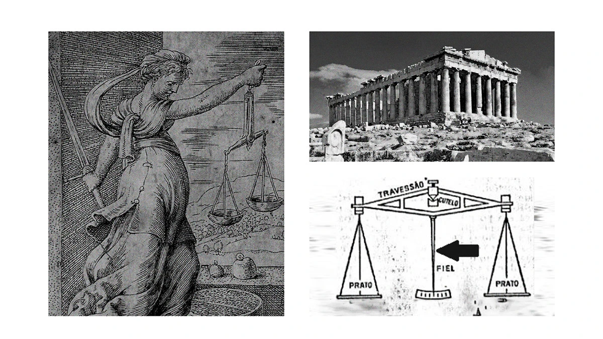
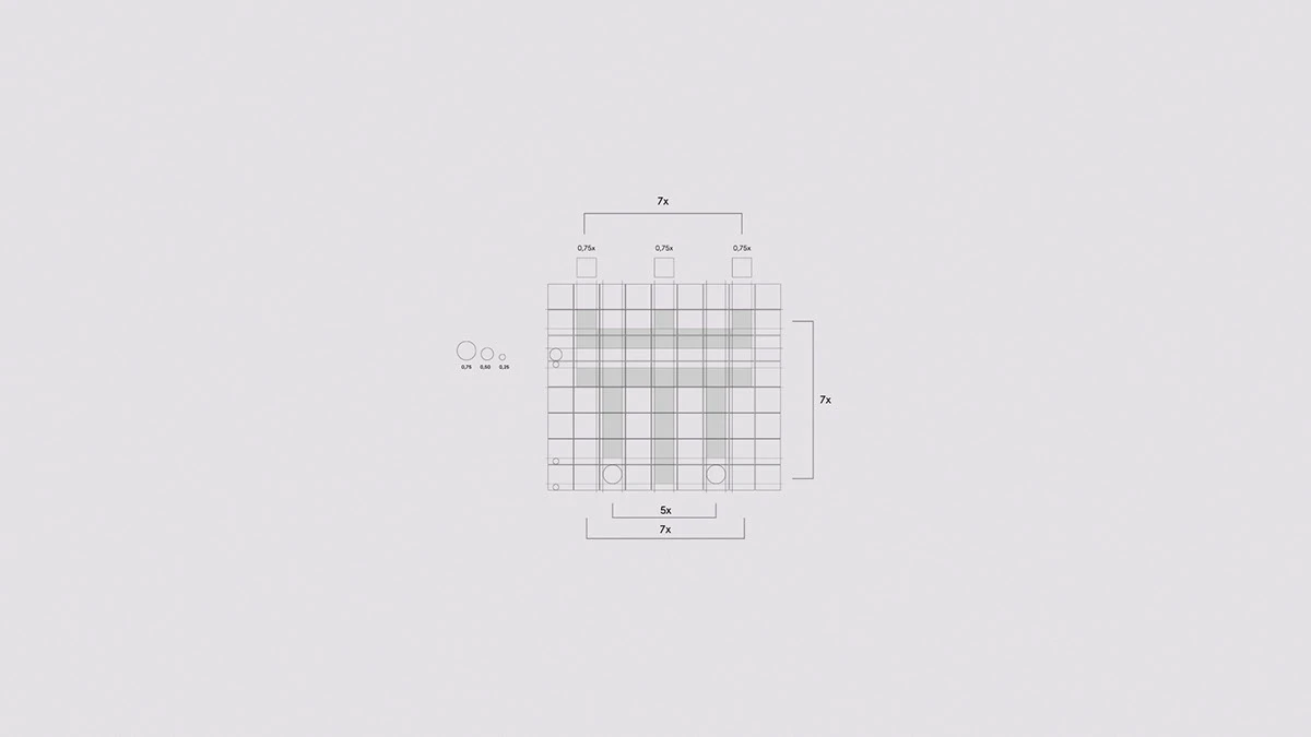
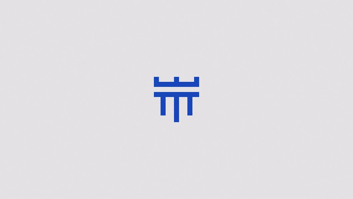
The challenge was to give institutional form to a personal name, without falling back on the clichés of the legal world. The symbol comes from the crossing of two images of law: the scales and the classical column. Reduced to vertical strokes and a horizontal beam, they form a geometric monogram that reads just as well at large size as in the corner of a document, with a clean sans-serif reinforcing the contemporary reading.
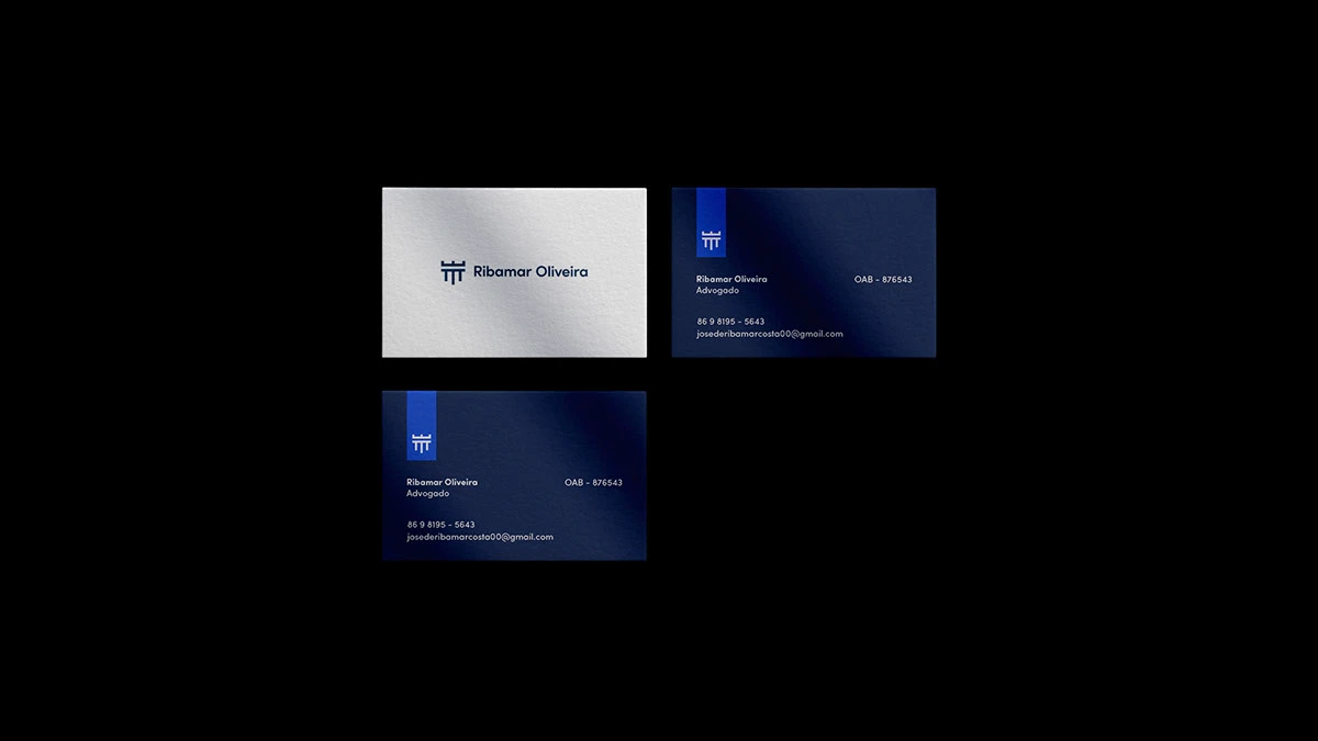
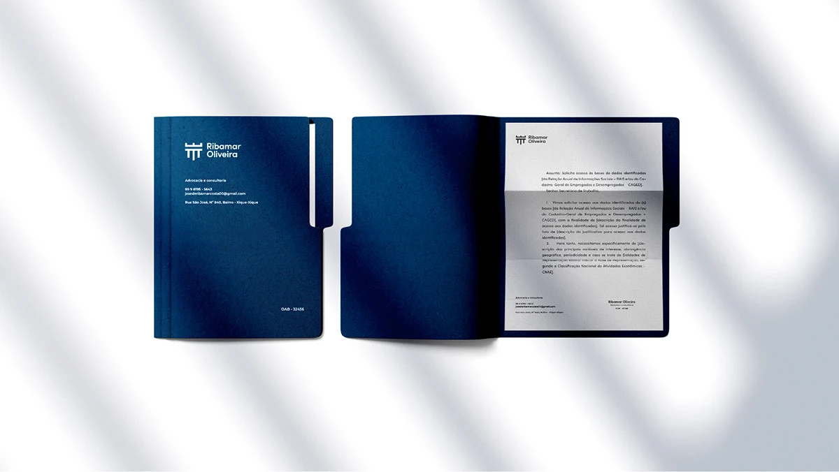
The result is a sober, workable system: business cards in two versions, letterhead and a document folder that present Ribamar with the same rigor he brings to a case.